Tools
Figma, FigJam, Photoshop, Illustrator,
Lean Canvas, Lyssna, Zoom and Lighthouse
Business Research
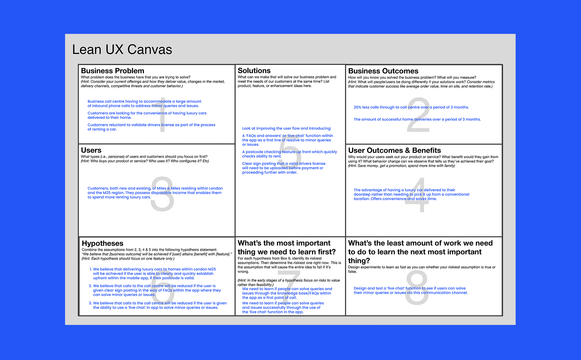
I began by understanding the business requirements. To facilitate the workshop with stakeholders I’ve used 'Lean Canvas' to help us quickly define the current problems, business goals, value propositions and metrics.
Business Goal
The goal was to design an intuitive platform for renting luxury cars from Miles & Miles in London, with the added convenience of home delivery. Central to the project was enabling users to seamlessly handle their inquiries directly within the app.
Business Problem
The business call center is managing a high volume of inbound phone calls to address minor queries and issues. Customers seek the convenience of having luxury cars delivered to their homes but are hesitant to provide driver's license validation as part of the rental process.
Design Review
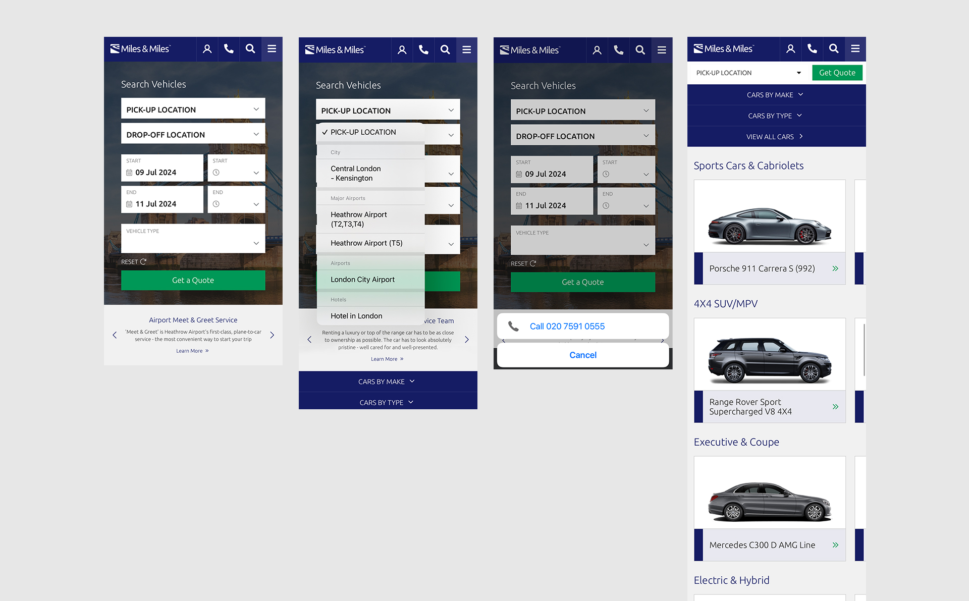
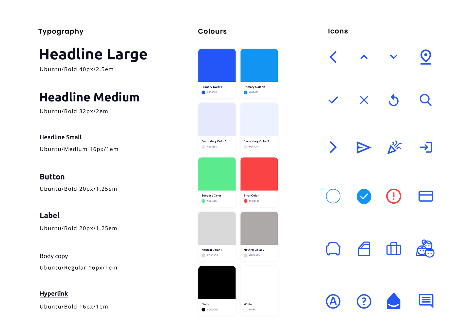
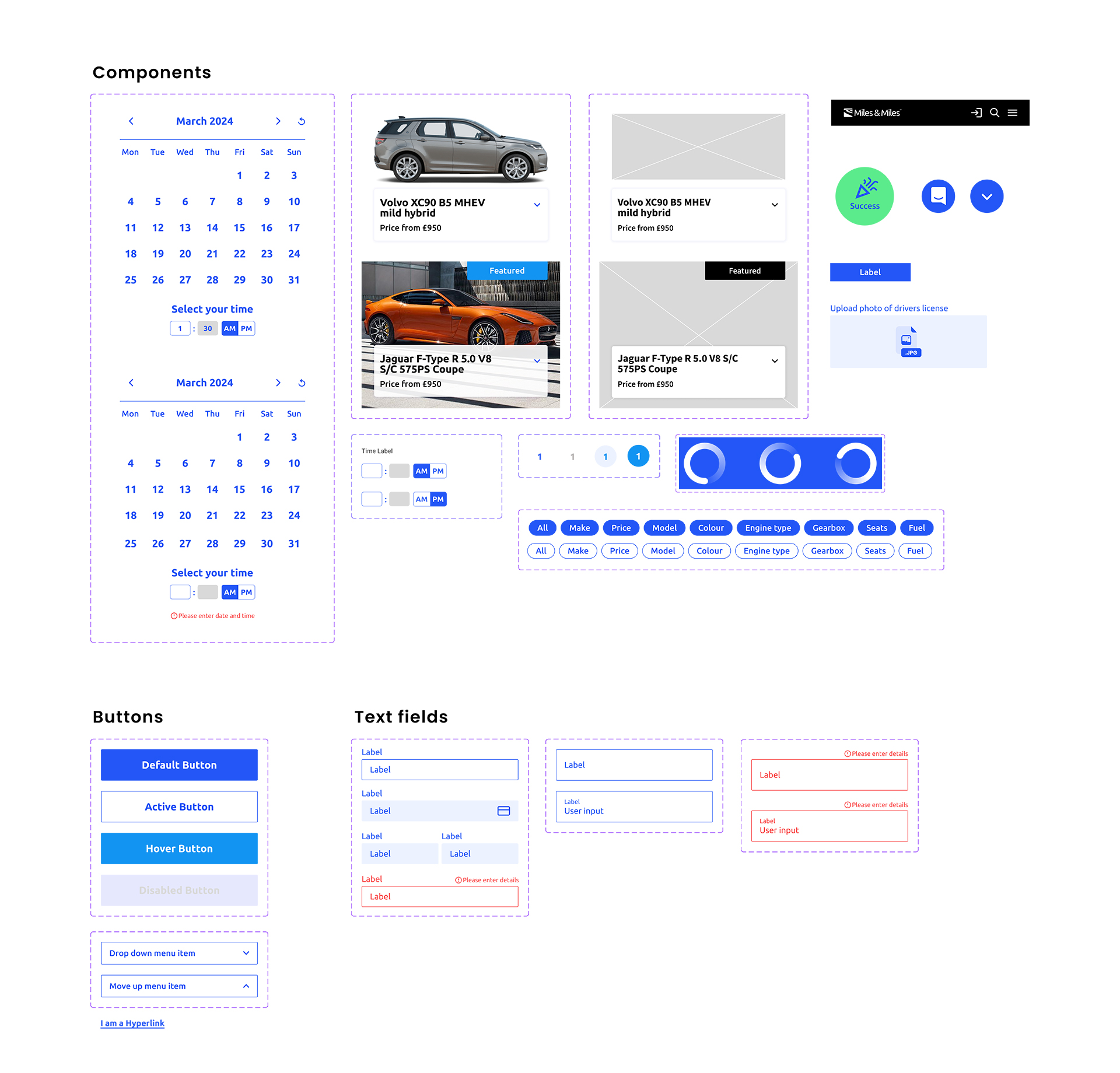
I’ve reviewed the current website to evaluate what works and what doesn’t – assumptions from my professional point of view. I recommend leveraging 'Material Design' components and icons to modernise and standardise the user interface, utilising tried and tested components for a best-in-class experience. This approach will facilitate streamlined collaboration with developers.
Slide to Reveal Existing Website and Improved Website
Improved Typography, Colours, Icons and Components (Combination of custom and Material Design) Styleguide
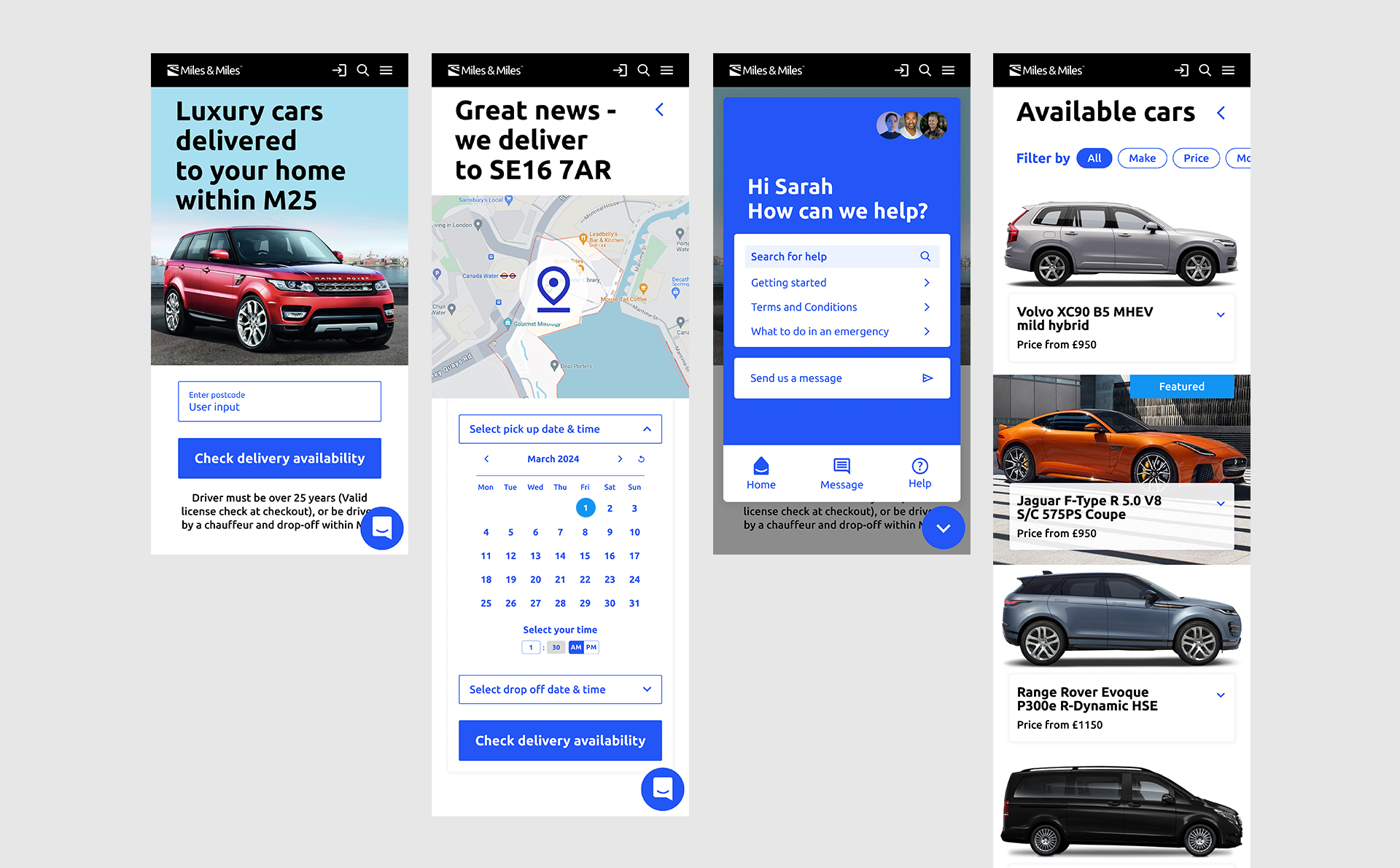
Swip to Reveal Improved User Flow
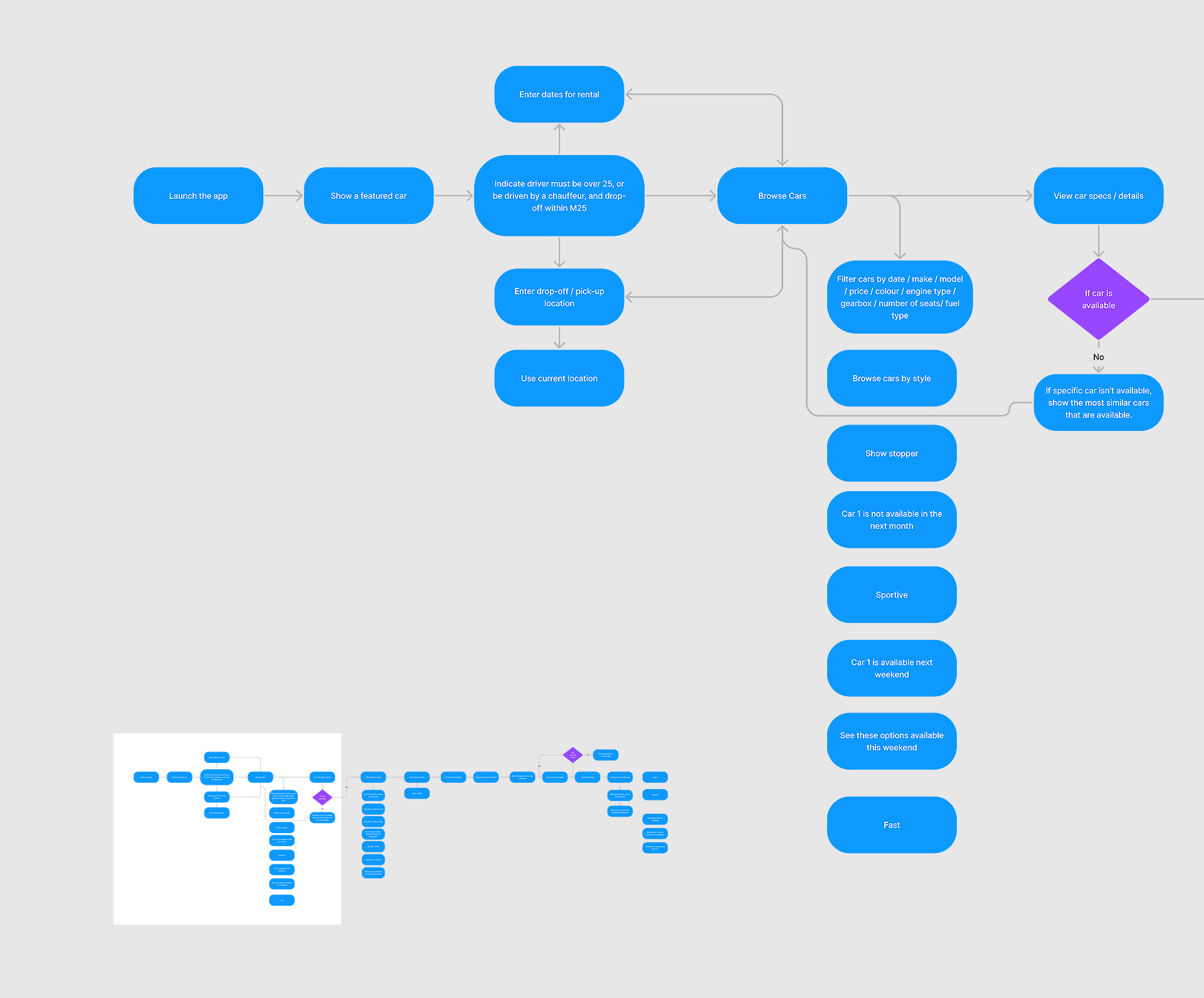
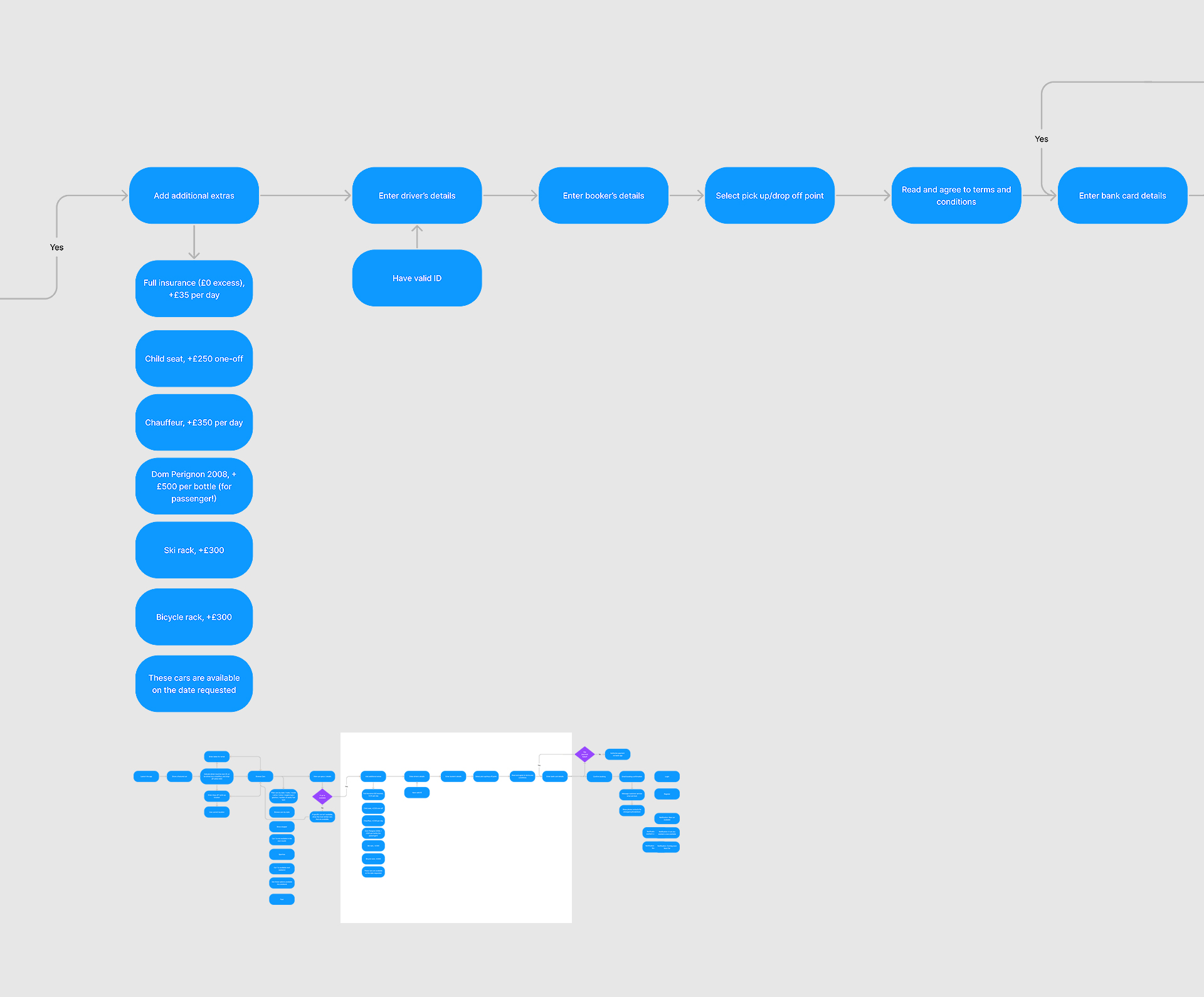
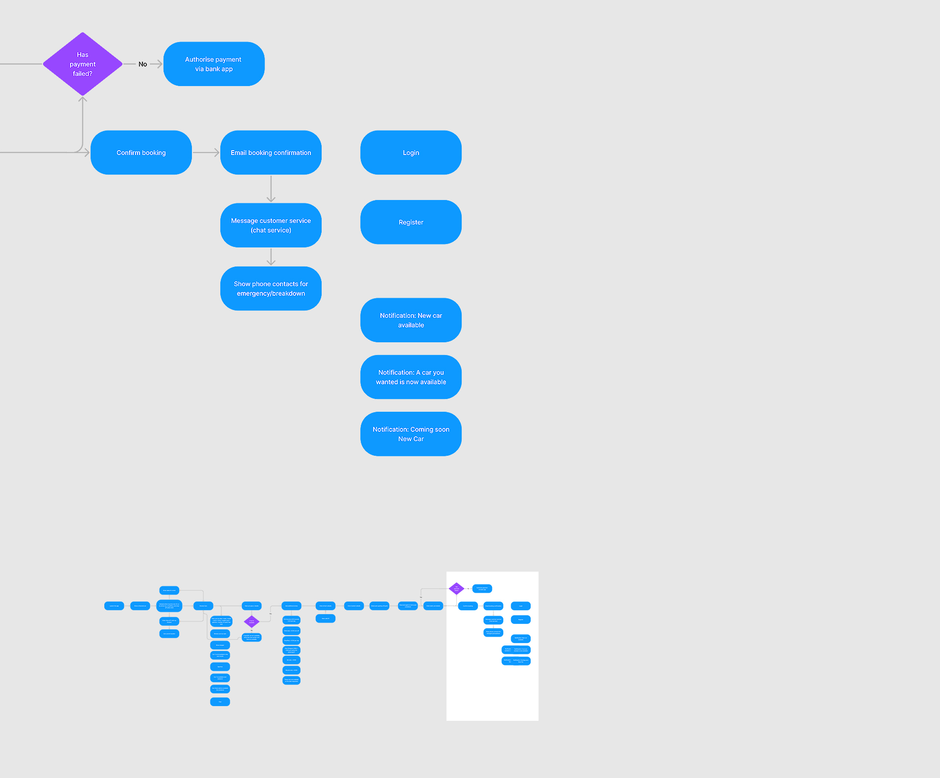
Happy Flow
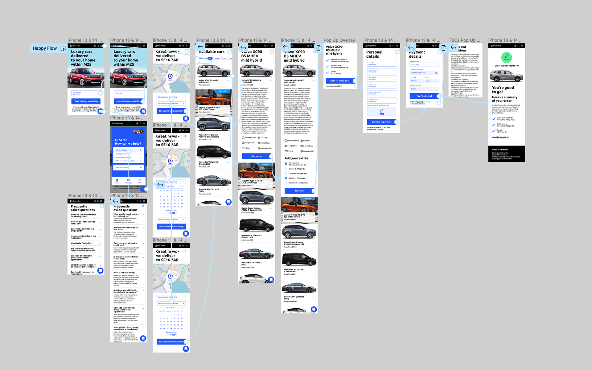
Figma Prototype
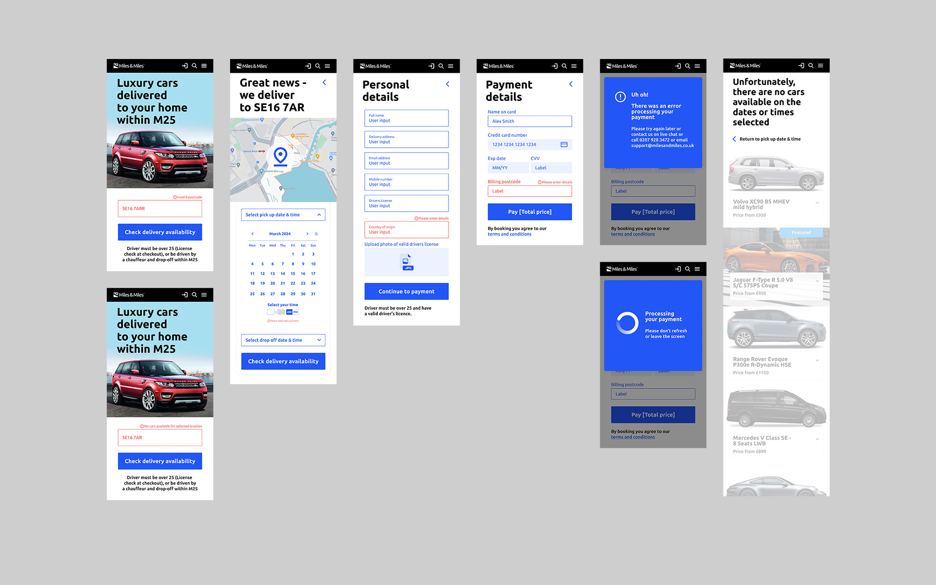
Unhappy Flow
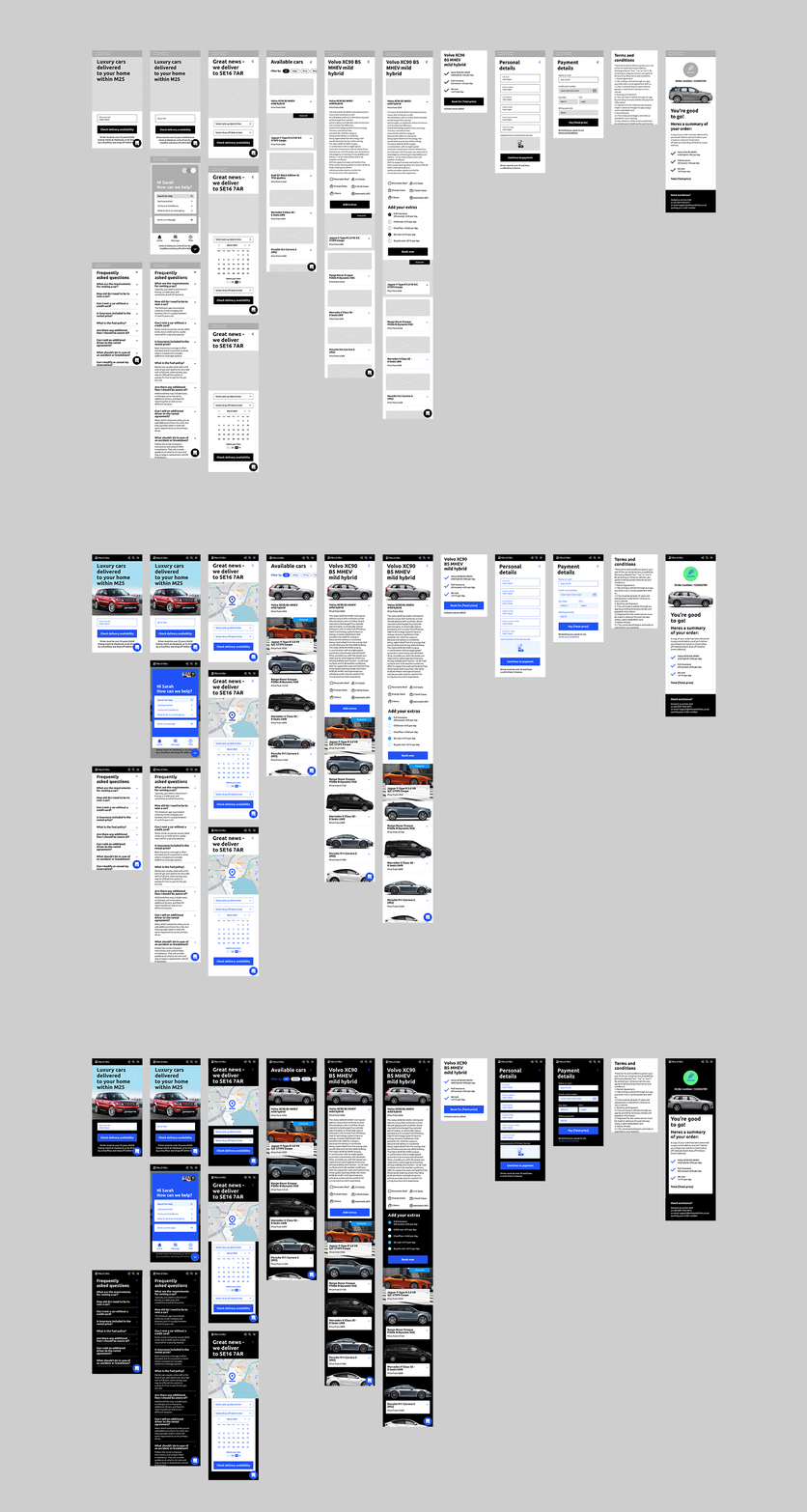
Wire Frame, Light and Dark mode
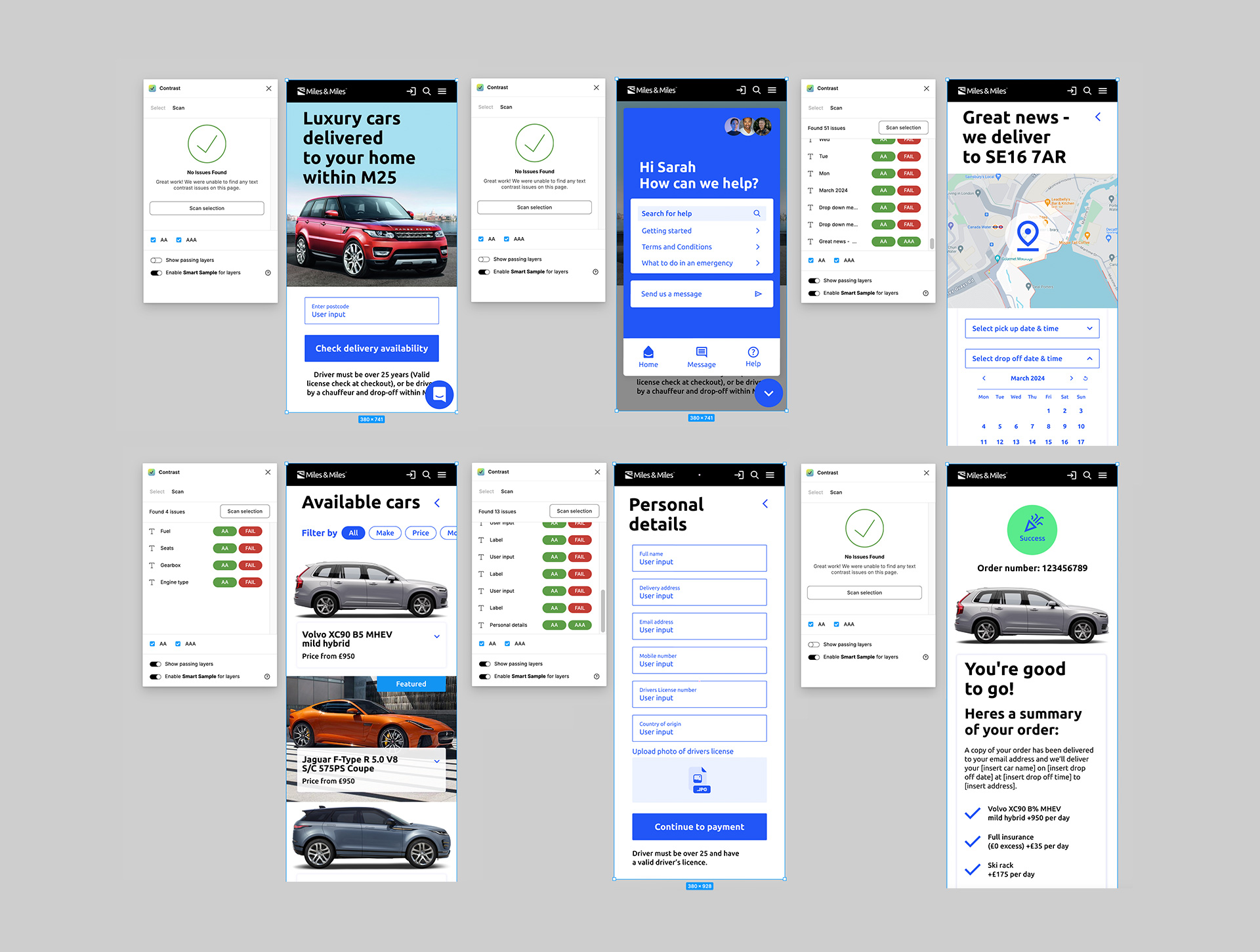
Accessibility
I want to ensure our new design is universal and works for everyone.
WCAG Validation
I have enhanced the website to align with the Web Content Accessibility Guidelines (WCAG) (At least AA) and filtered decisions which I can influence, from an inclusive design POV.
Performance
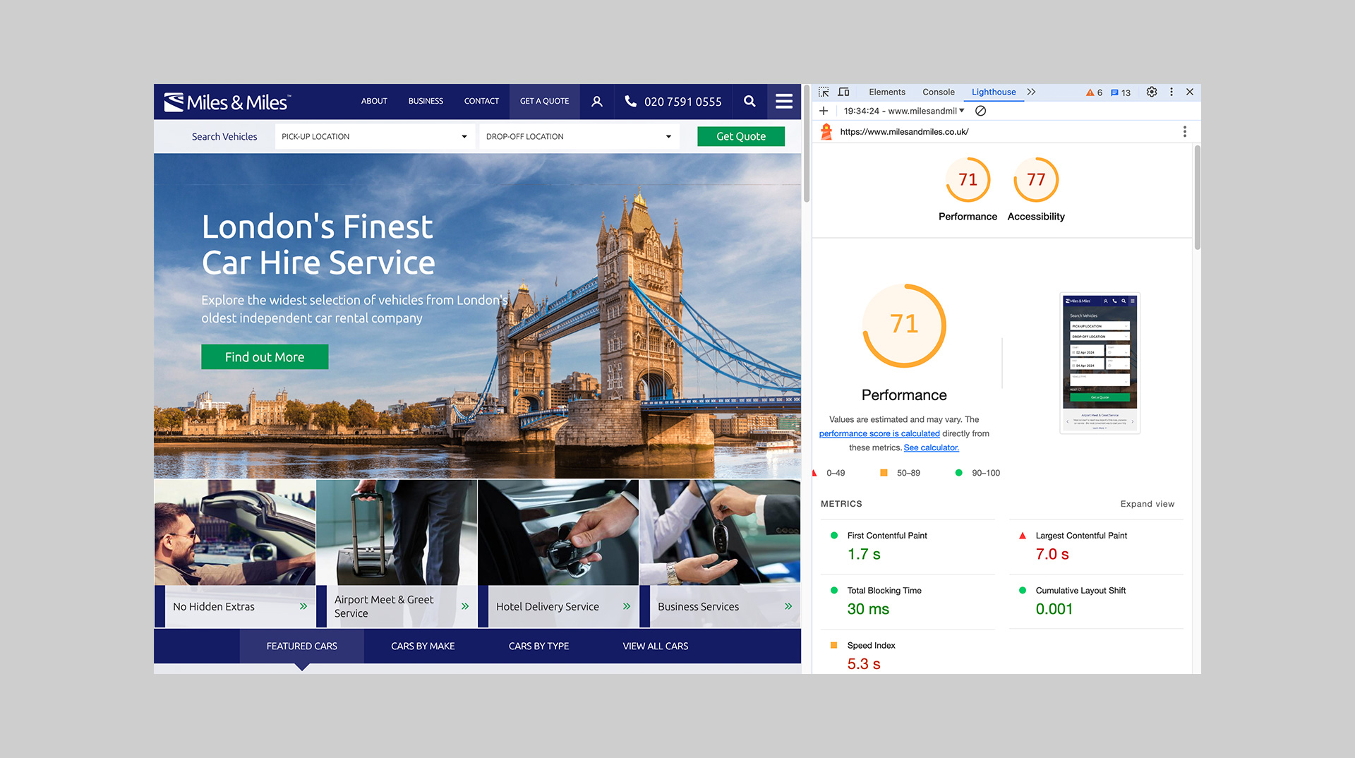
I’ve analysed the current website using Google's Lighthouse Page Speed service to identify performance issues affecting accessibility and conversion rates. One key area for improvement is optimising high-resolution images, which could enhance loading times by at least 20%.
Achieved
- Optimal colour contrast ratio
- Website is responsive and accessible on different screen sizes
- Content is not cropped
- Optimisation of high-resolution images
To Be Addressed
- Website is navigable with a keyboard
- Alt text on images
Achieved
- Optimal colour contrast ratio
- Website is responsive and accessible on different screen sizes
- Content is not cropped
- Optimisation of high-resolution images
To be addressed
- Website is navigable with a keyboard
- Alt text on images
Usability Testing
I aim to validate all design assumptions by conducting a thorough design review and engaging in discussions with business stakeholders.
Design Assumptions
- We believe that calls to the call centre will be reduced if the user is given:
a.) Clear sign posting in the way of FAQs within the app where they can solve minor queries or issues
b.) The ability to use a ‘live chat’ in app to solve minor queries or issues
- We believe that delivering luxury cars to homes within London M25 will be achieved if the user is able to clearly and quickly establish upfront within the mobile app, if their postcode is valid
- Clear sign posting that a valid drivers license will need to be uploaded before payment or proceeding further with order
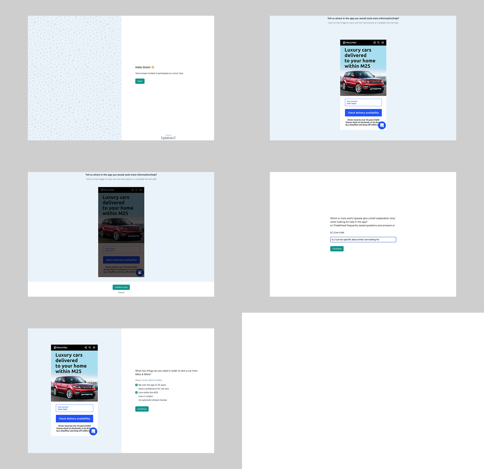
Lyssna Test
Questions
1.) Tell us where in the app you would seek more information/help?
2.) Which is more useful (please give a brief explanation why) when looking for help in the app?
a.) Predefined FAQs and answers or
b.) Live chat
3.) What two things do you need in order to rent a car from Miles & Miles?
Findings from Design Test
1&2.) Implement 'FAQs and answers' over a 'live chat' function and place in top menu
3.) Need clearer signposting that a valid drivers license is also required (along with living within the M25 and being over the age of 25 years) to rent a car
50%
of users from the heat mapping results clicked top right when looking for more information
80%
answered a.) FAQs and answers is more useful when looking to solve minor issues in app
75%
of users said you need to 'Live within the M25' and 'Be over the age of 25 years' to rent a car
Design Handover
and Q&A
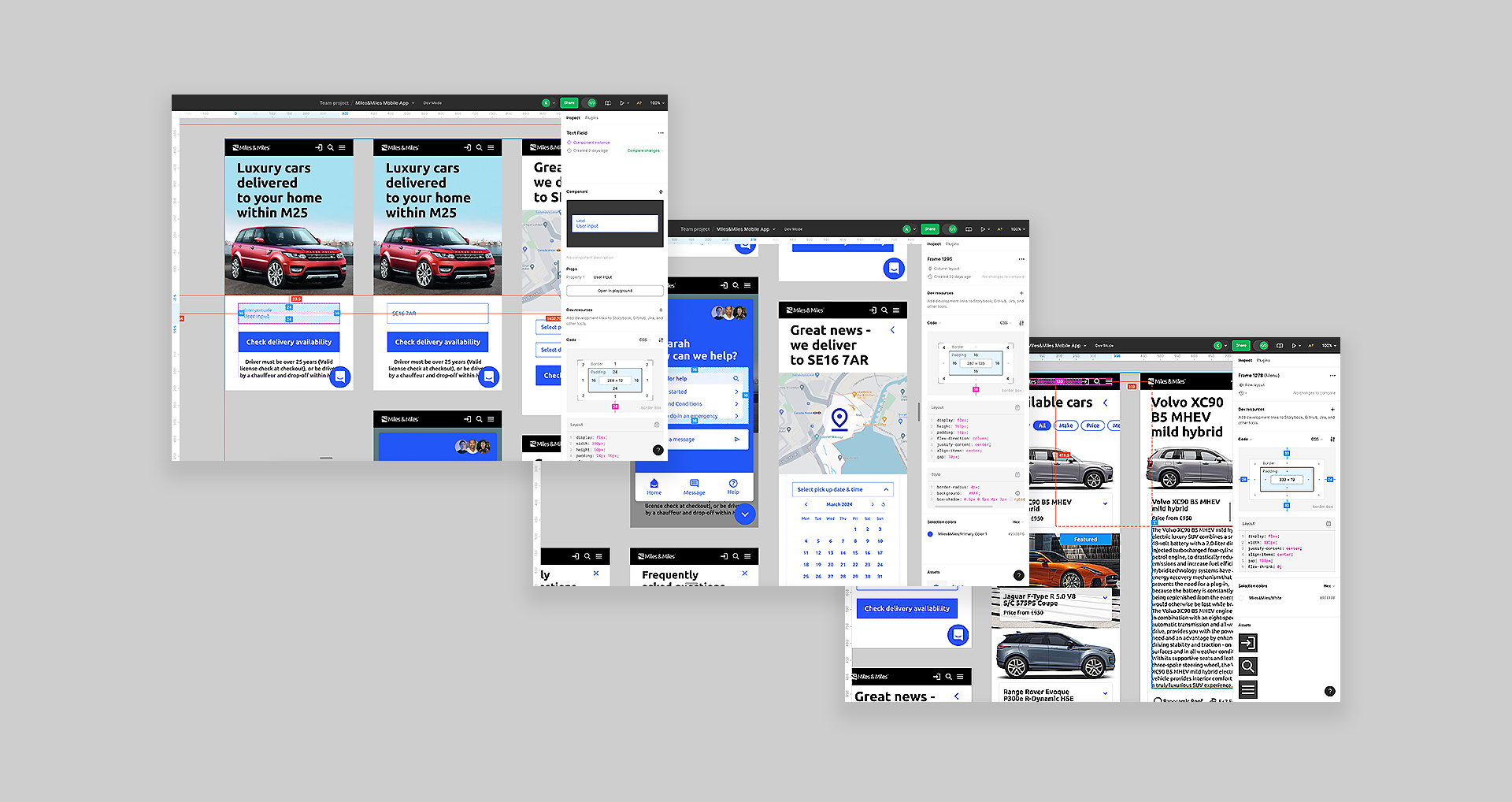
To ensure the design is implemented to the highest standard, it's important to maintain regular communication and collaboration with the development team.
Working Together
A comprehensive handover of all design assets for the web developer is required to start implementing in code. This includes user journeys, the sitemap, content (such as copy, documents, and images in all required resolutions and formats), icons, fonts, wireframes, and updates to the style guide.
Design Q&A
Regular meetings are required with the development team to address any additional requirements, discuss potential improvements or compromises, and conduct quality assurance on their latest implementations. This will ensure the website is delivered smoothly and on time.
Design Q&A
Regular meetings are required with the development team to address any additional requirements, discuss potential improvements or compromises, and conduct quality assurance on their latest implementations. This will ensure the website is delivered smoothly and on time.
Get in touch
Kerry
Senior Digital Designer
kerry@kezdesigns.com
LinkedIn
©kezdesigns 2025
Selected Works

KFCConcept, Photoshoot and OOH

Sainsbury'sUX and Kiosk Interface Design

PASHNBranding, UX and Web Design

WHAT'S POSSIBLE GROUPBranding, UX and Web Design

POWERADEConcept, Photoshoot and OOH

feather & blackBrand Positioning, UX and Web Design

PrepayPowerAnimated 15 & 30 second TVC