Client
Sainsbury's
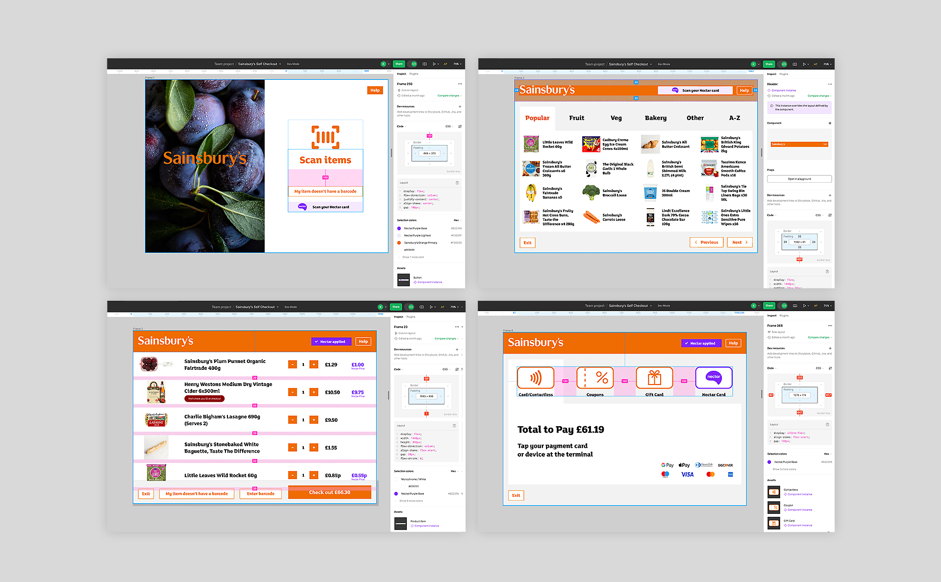
This project formed part of a 7-Week UX Skills Bootcamp where I was challenged to design an improved self-checkout interface and screen flow for Sainsbury’s to enhance user efficiency, focusing on design, technology, and interactivity.
Design Process
- Business Research
- Design Review
- Accessibility
- Usability Testing (Testing WIP)
- Design Handover and Q&A
Tools
Figma, FigJam, Photoshop, Illustrator and Lean Canvas
Business Research
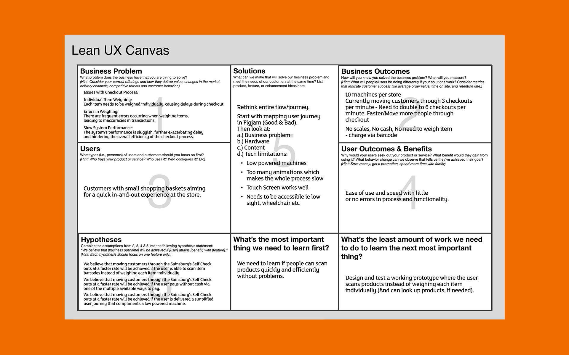
I began by understanding the business requirements. To facilitate the workshop with stakeholders I’ve used 'Lean Canvas' to help us quickly define the current problems, business goals, value propositions and metrics.
Business Goal
Currently, each store has 10 machines, and customers are moving through 3 checkouts per minute. We need to double this rate to 6 checkouts per minute by eliminating scales, cash, and the need to weigh items.
Business Problem
Each item needs to be weighed individually, causing delays during checkout. Frequent errors during weighing lead to transaction inaccuracies. Additionally, the system's sluggish performance further exacerbates delays and hinders the overall efficiency of the checkout process.
Design Review
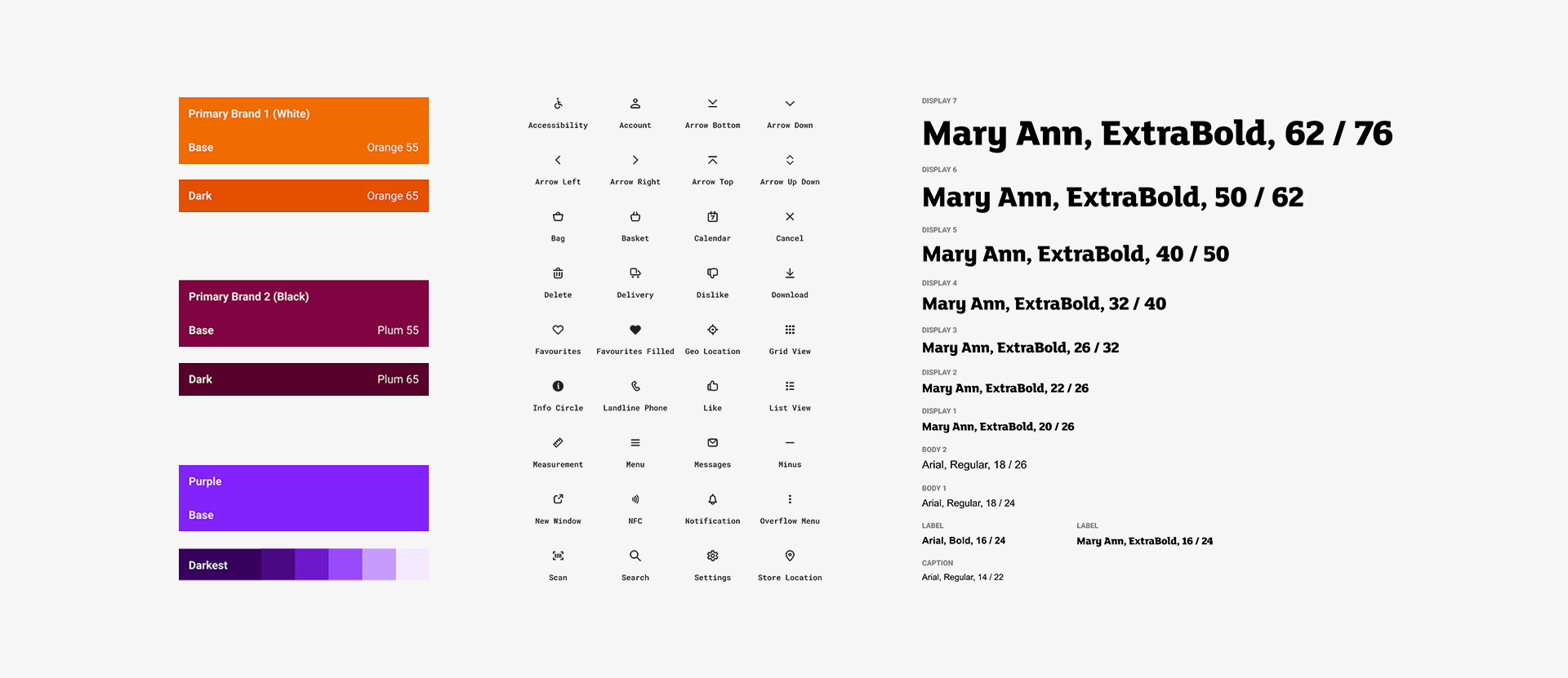
I’ve reviewed the current self-checkout flow to evaluate what works and what doesn’t – assumptions from my professional point of view. Based on using the current Sainsbury’s design system: luna.sainsburys.co.uk to improve the design and function of the self-checkout screens.
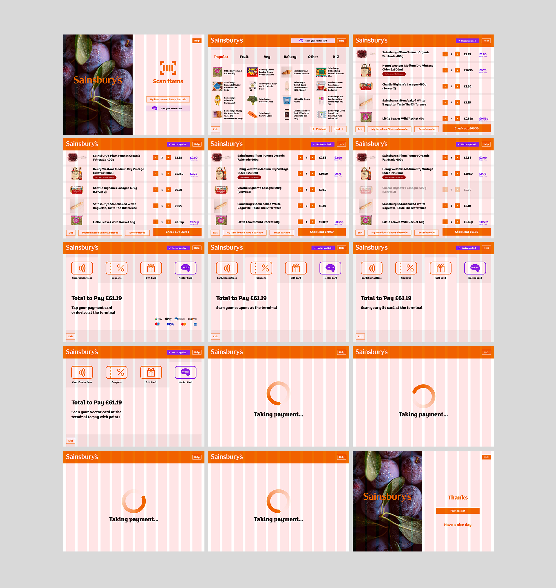
Improved UI using Sainsbury’s Luna Design System Styleguide
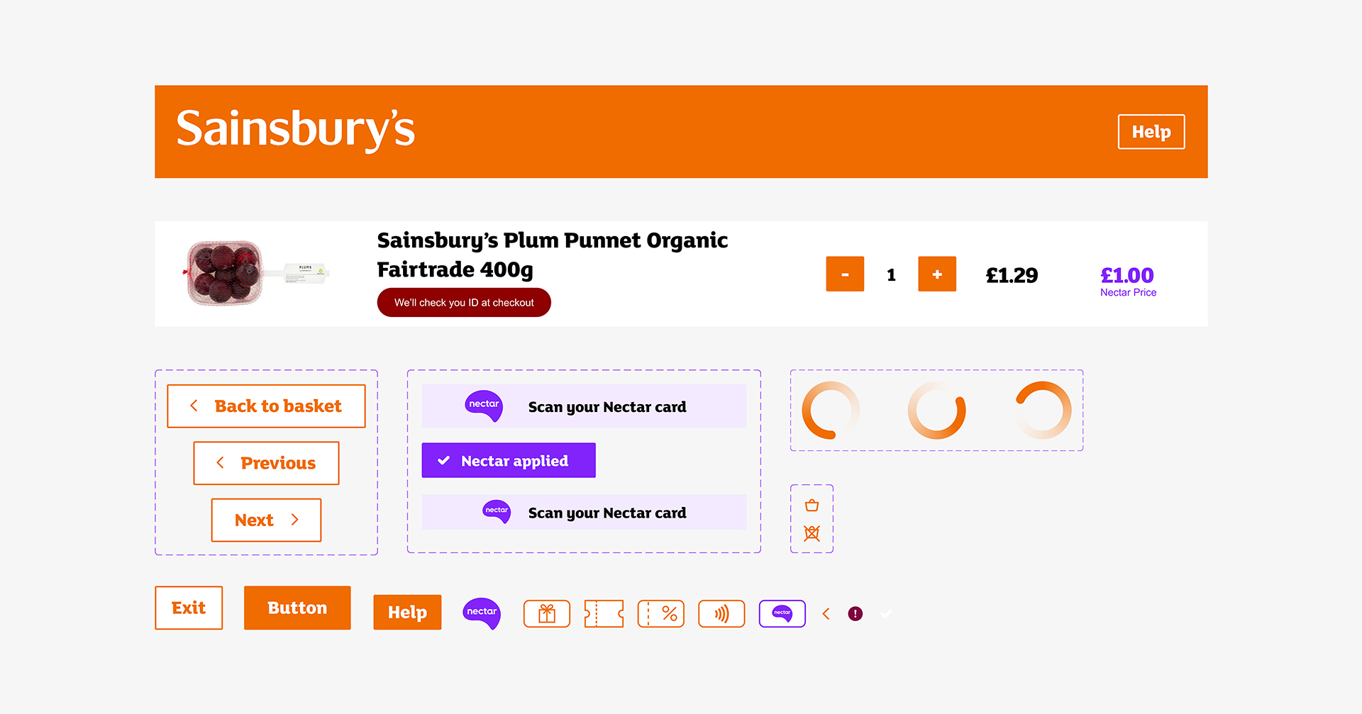
Components, Buttons and Icons
Swipe to Reveal Improved User Flow
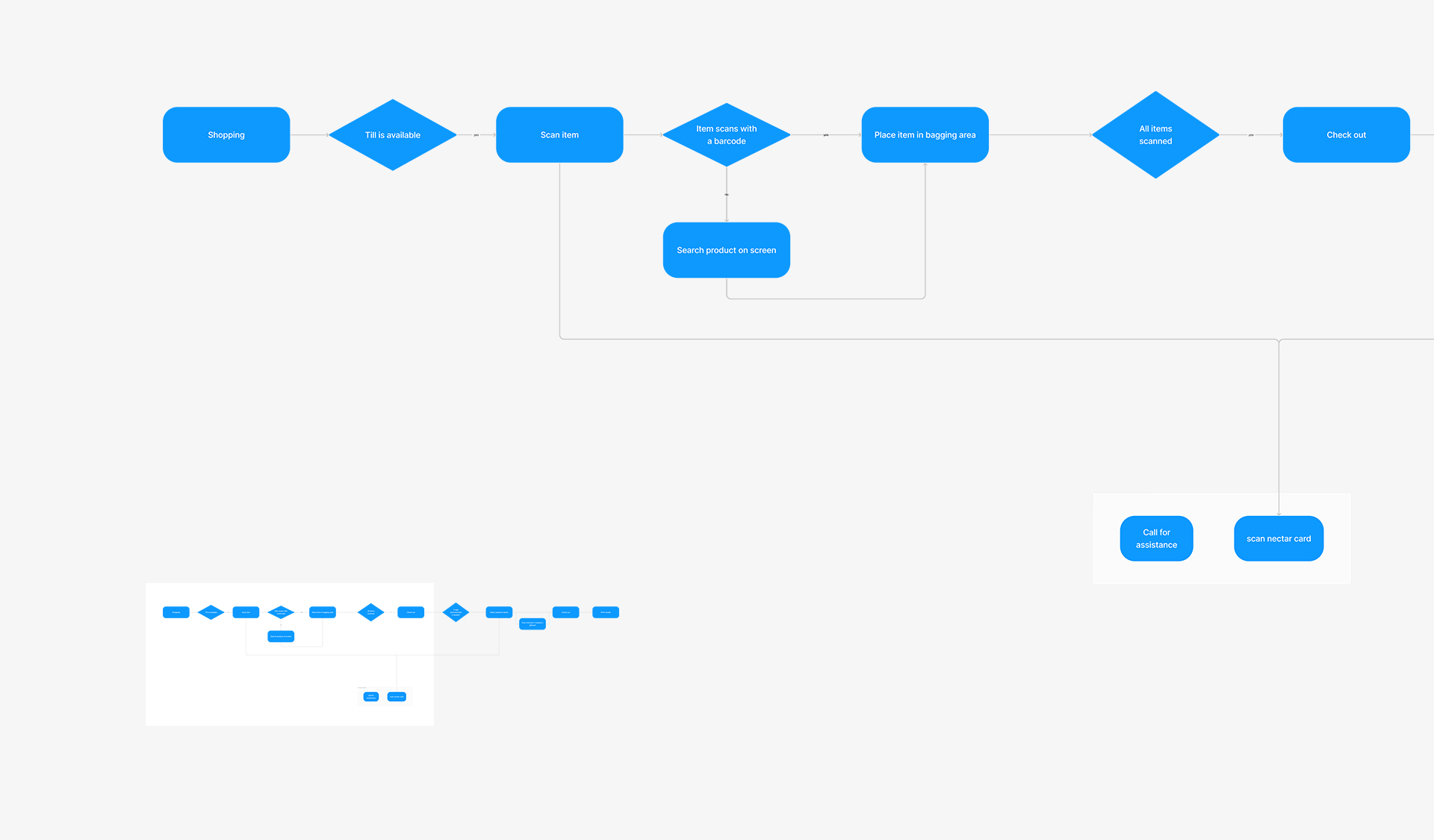
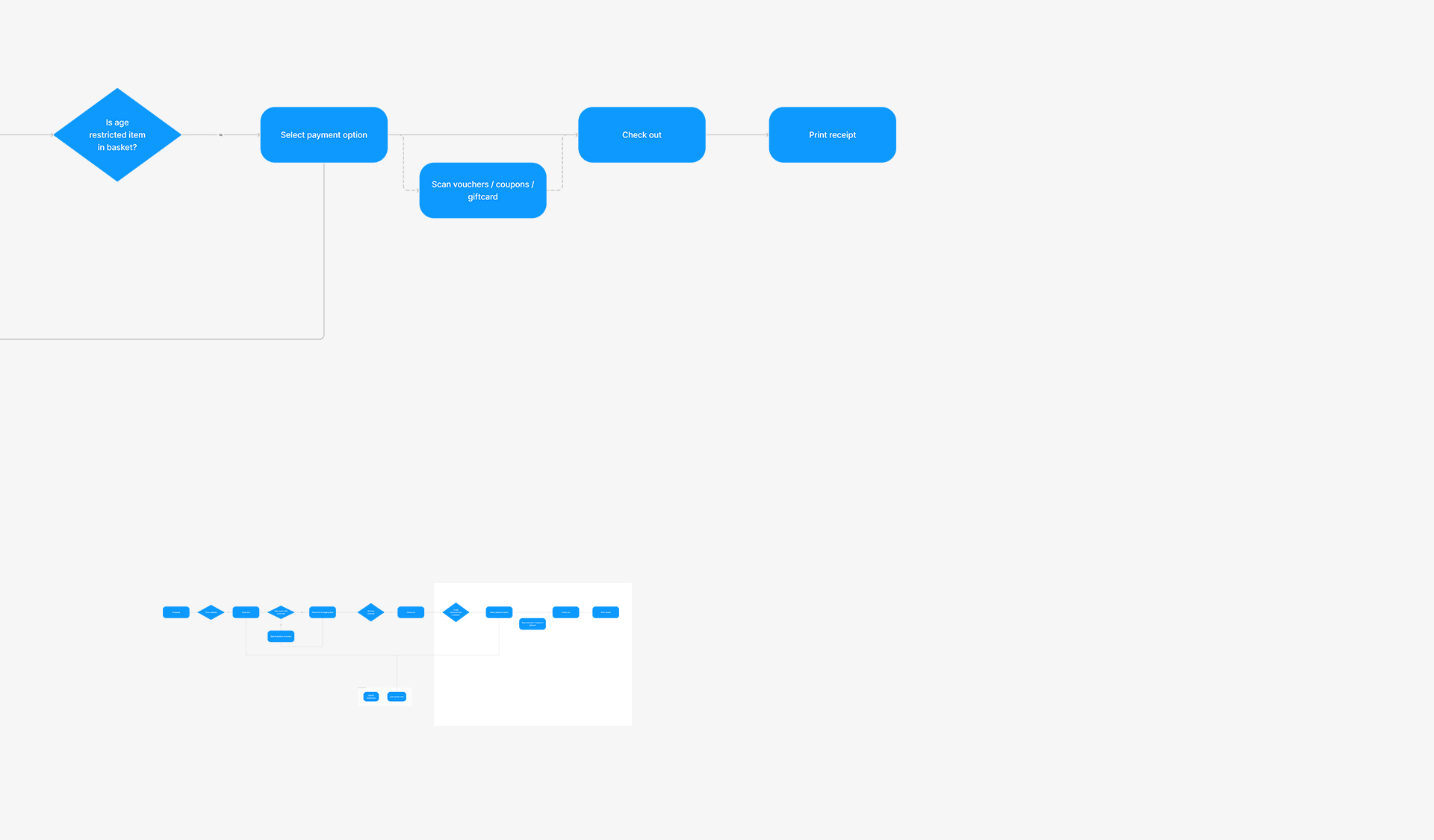
Happy Flow
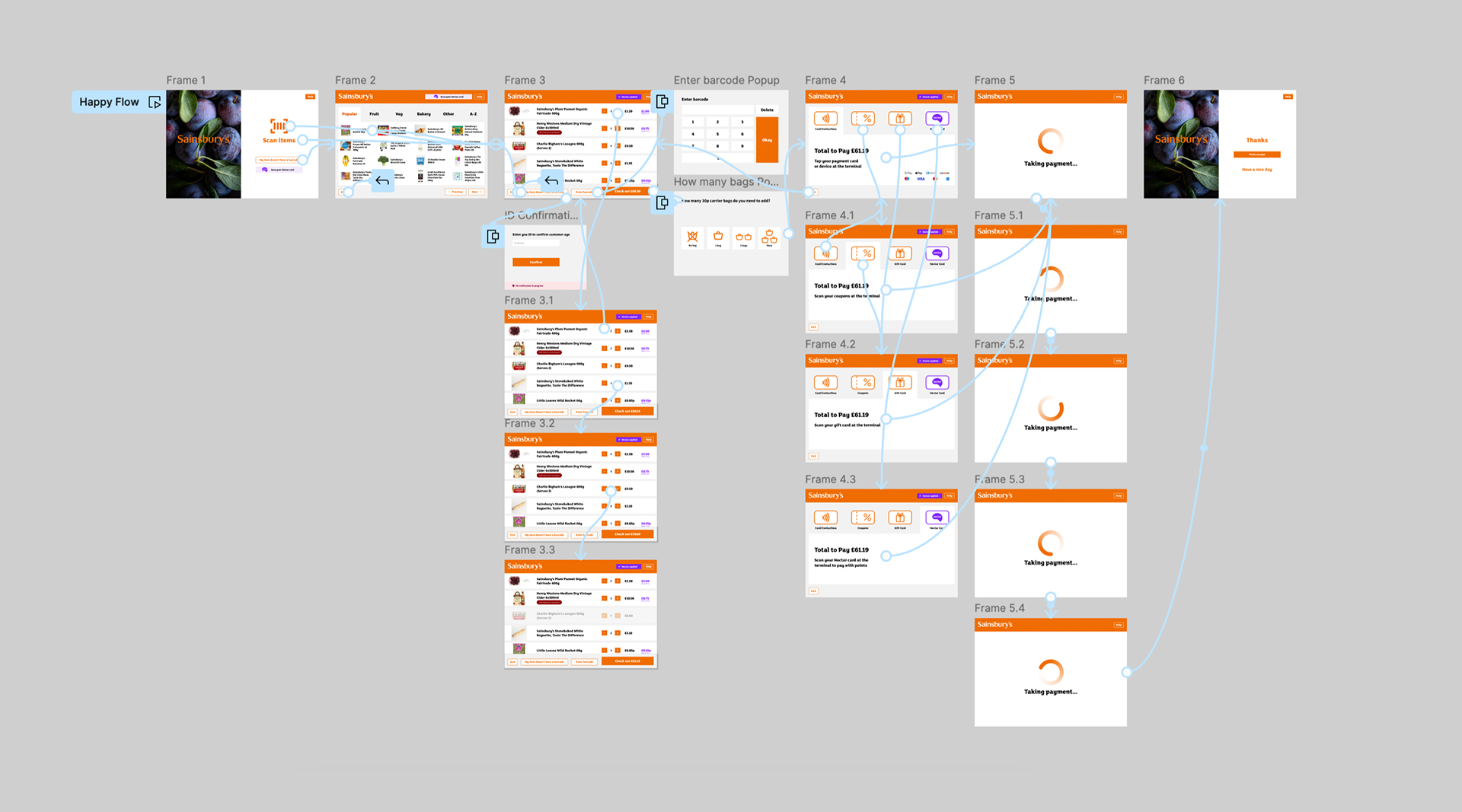
Figma Prototype
12 Column Grid System
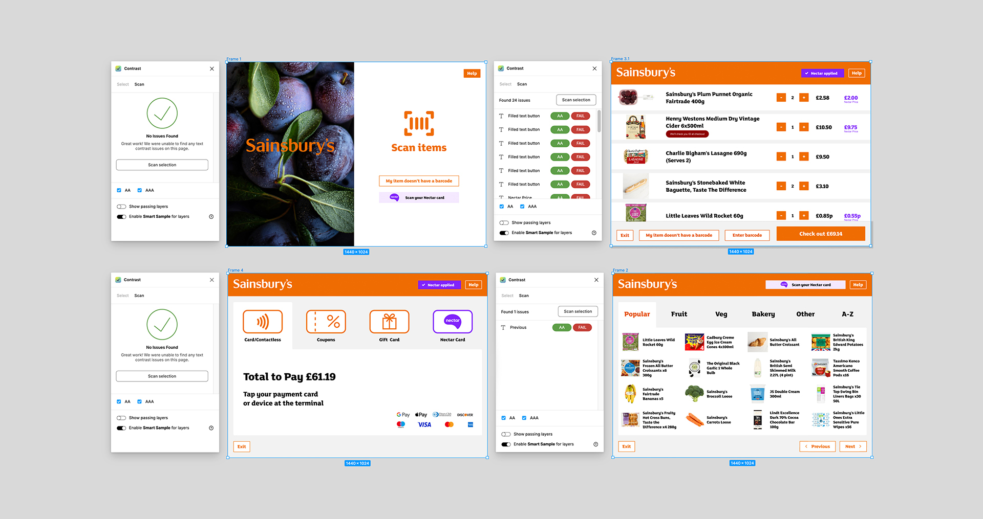
Accessibility
Approximately 1 in 5 people in the UK have a disability or impairment that impacts their daily life. But accessible design is not just about disability. It benefits all users by striving for simple, usable and inclusive experiences.
WCAG Validation
Operating within the design system parameters while advocating for adjustments where feasible to ensure alignment with the Web Content Accessibility Guidelines (WCAG), aiming for at least AA compliance.
Performance
The machines are low-powered, resulting in sluggish system performance and further delays, which hinder the overall efficiency of the checkout process. Simplifying transitions and animations across screens will enhance usability and improve the overall experience.
Achieved
- Optimal colour contrast ratio
- Icons supported by caption
- Left align blocks of text
- Use of sentence case text
Design Handover
and Q&A
To ensure the design is implemented to the highest standard, it's important to maintain regular communication and collaboration with the development team.
Working Together
A comprehensive handover of all design assets for the web developer is required to start implementing in code. This includes user journeys, content (such as copy, documents, and images), icons, fonts, wireframes, and updates to the style guide.
Design Q&A
Regular meetings are required with the development team to address any additional requirements, discuss potential improvements or compromises, and conduct quality assurance on their latest implementations. This will ensure the screens are delivered smoothly and on time.
Get in touch
Kerry
Senior Digital Designer
kerry@kezdesigns.com
LinkedIn
©kezdesigns 2025
Selected Works

Miles & MilesUX and Web Design

KFCConcept, Photoshoot and OOH

PASHNBranding, UX and Web Design

WHAT'S POSSIBLE GROUPBranding, UX and Web Design

POWERADEConcept, Photoshoot and OOH

feather & blackBrand Positioning, UX and Web Design

PrepayPowerAnimated 15 & 30 second TVC